I didn't know I was thinking of having different layouts for different posts until I was going through a magazine at the Nieuwe Instituut's museum in Rotterdam. I was still playing around with the idea of making my own website and was going through many different personal websites the days prior to it (Really loved the way anhvn styles different posts on their blog btw). Big vindication for the concept of taking some distance after long research sessions, letting ideas sit and marinate so that you can form unexpected connections when you least expect them. Sounds overly dramatic for a simple blog facelift, but until now I always subconsciously thought of all pages of a website looking the same or following the same theme.
Going back to The Nieuwe Instituut. They have an amazing library with architectural/urban design and planning themed books, and even let you take some of them home for free! I was leafing through one of these books and came across the following:
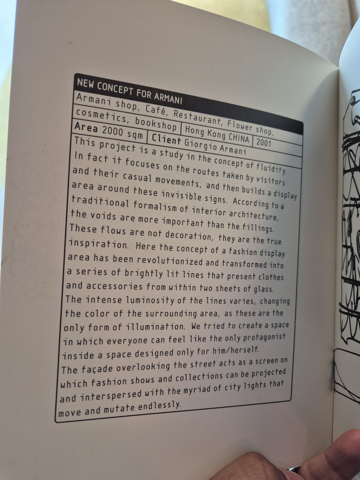
Something about the heavy text-focus and the clear metadata distinction jumped out at me, and I immediately thought about the site and knew that I had to try to recreate this as a styling for my posts. It was simple, compact, and was one of the first times I didn't feel daunted by a layout considering my miniscule experience with html and css.
Example of the frontmatter used in this post to generate the metadata:
---
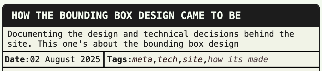
title: How the bounding box design came to be
description: Documenting the design and technical decisions behind the site. This one's about the bounding box design
date: 2025-08-02
tags: ['meta', 'tech', 'site', 'how its made', 'projects']
layout: layouts/bounding_box.njk
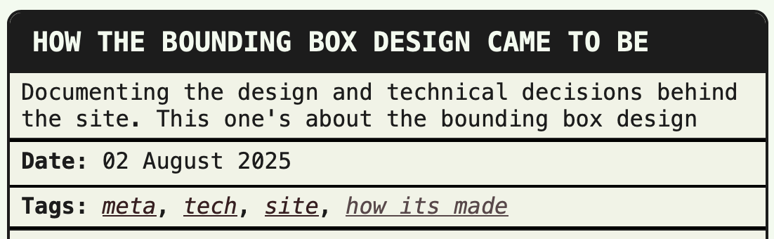
---The only issue I still face is making it responsive on mobile. Because of the small screen width, it's hard to keep the layout while also keeping the text legible, so I've resorted to having the different metadata sections on different lines; which doesn't look as nice, but then again, you should be reading these on your laptop or PC anyway.
My main takeaway from this whole experience is to read more small, indie magazines or self-publishings and to be on the lookout for fun page layouts to steal take inspiration from.